Branding with Ceramic Mugs: Logos, Colors, and Design That Customers Keep
Branding with Ceramic Mugs: Logos, Colors, and Design That Customers Keep
A ceramic mug is one of the few branded items that people keep for years and use every single day. A t-shirt gets worn out. A tote bag gets lost. A branded mug sits on a desk, a kitchen shelf, or a café table, quietly repeating your name dozens of times a day. That longevity makes mugs one of the highest-value brand carriers available, but only when the branding is designed properly. A logo crammed onto a mug awkwardly, colors that do not match your identity, or a finish that scratches after a month all destroy the brand value instead of building it. This guide shows you how to design branding for ceramic mugs that customers genuinely want to keep, from logo placement to packaging, and closes with a spec sheet you can hand directly to your designer and factory.
Define What the Mug Is For Before Designing Anything
The most effective branded mugs are designed backward from a goal. Are these mugs for customers, employees, or partners? A customer-facing mug must reinforce the product experience, for example a coffee roaster's mug that feels like part of the coffee ritual. An employee mug must be practical and durable enough for daily office use. A partner or client gift must feel premium enough to represent the relationship. Write down who receives the mug, where they will use it, and what emotion the brand should evoke, then hold every design decision against those three answers.
The goal also determines the print budget. A high-volume promotional mug with a single-color logo has a very different cost structure from a low-volume premium gift with full-color decals and a gift box. Decide the budget early, because it constrains the technique, and the technique constrains what the artwork can look like. Trying to design first and fit the budget later is how brands end up with artwork that had to be redrawn three times.
Logo Placement: Respect the Mug's Shape
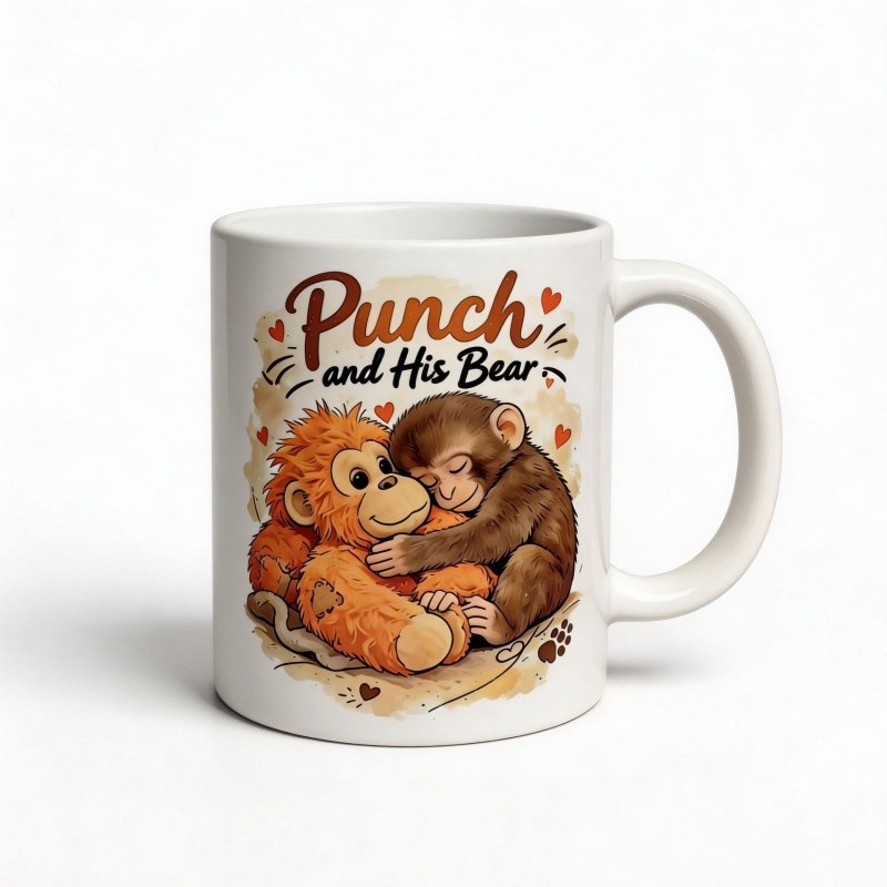
The mug is a cylinder, and a cylinder wraps. That simple fact drives every rule about logo placement. The center of the mug, vertically, is where the eye lands first, so primary logos belong there, roughly in the middle third of the height. Artwork placed too low disappears when the mug sits on a desk, because the rim of the mug or the user's hand hides it. Artwork placed too high crowds the rim and looks unbalanced. The safest professional layout is a single focal logo on the front center, with optional small supporting text on the opposite side or near the base.
Size matters more than most brands realize. A logo that fills the entire printable area looks aggressive and leaves no breathing room, while a logo that is too small reads as an afterthought. As a rule of thumb, leave at least ten percent clear space around the logo on every side, and never run artwork into the handle area, where the curve distorts the design and the print physically cannot follow. If the design includes text, keep the line length short enough that it does not wrap awkwardly across the cylinder, and test how the text reads when the mug is held, because the user sees the mug at a slight angle, not flat.
Brand Colors: Match the Mug, Not Just the File
Your brand colors were designed for screens and paper, and they will shift on ceramic, so the printed result must be validated against your brand standard, not assumed. The glaze of the mug is the first variable: the same ink reads differently on a white body, an ivory body, and a colored body. White and ivory bodies give the most predictable color reproduction, while colored bodies require the factory to adjust inks and often limit the palette.
The second variable is the printing method. Silk-screen inks are opaque and match solid brand colors closely, which makes them ideal for spot-color logos. Decal printing handles gradients and tints well but should be matched against a physical proof, because digital previews lie. Sublimation shifts colors according to the dye chemistry, so brands with a precise Pantone identity should request a color-matched sample before production and approve the final shade in writing.
A professional practice is to send the factory your Pantone or RGB reference for each brand color, approve a physical color sample, and keep that sample as the benchmark for the production batch. Store the approved sample safely, because it becomes your legal reference if a future order arrives with the wrong shade. Color tolerance should be written into the contract, typically within a small deviation that the factory can guarantee, and any exception should be agreed before production rather than argued after shipment.
Choose the Technique That Serves the Design
The printing method should be chosen after the artwork is understood, not before. For a single-color or two-color logo that must be perfectly color-matched and survive heavy washing, silk-screen printing is the professional default, and it also gives the best price at volume. For artwork with gradients, small text, or photographic elements, ceramic decals deliver the full-color result that screen printing cannot. For photographic wraps around the entire mug on a white body, sublimation is the right tool, provided the mugs will not face years of commercial dishwashing.
Do not let a supplier talk you into a method because it is cheaper. The question is whether the method can reproduce your design within your quality bar. If your brand lives on a precise logo mark, a cheap print that is slightly off-color damages the brand more than a slightly higher per-piece cost protects the budget. If your brand lives on photography, a method that flattens the image into a low-quality graphic is a waste of the entire campaign.
Seasonal Lines and Limited Editions
Seasonal mugs are one of the fastest-growing ways to keep a brand visible, because a holiday mug gets used, photographed, and given as a gift. Easter, Mother's Day, Christmas, and spring floral themes consistently outperform generic designs, and a limited edition creates urgency that a permanent design cannot.
The discipline of seasonal lines is planning and freshness. Holiday themes must be designed and produced months ahead of the season, because factory capacity, shipping, and retail shelf windows all close earlier than consumers imagine. A limited edition should also be visibly different from the core line, in shape, color, or artwork, so collectors and customers can tell it apart, and the edition size should be announced so the scarcity is real and credible. When the season ends, retire the design completely; a limited edition that lingers on the shelf quietly destroys the value of the whole series.
Packaging and the Unboxing Moment
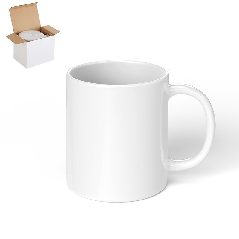
The mug is the gift, but the box is the first impression. For a customer or partner gift, packaging that protects the mug is also packaging that signals the brand's quality, so a plain cardboard box with a branded sleeve, a protective insert, and a care card is worth the small additional cost. Include the brand story or the care instructions on the card, because a care card that explains dishwasher and microwave safety reduces breakage complaints and extends the life of the branded product.
For retail and café lines, packaging must balance protection, shelf presence, and cost per unit. A simple sleeve that shows the printed mug through a window sells better than a fully opaque box, and stackable mug shapes reduce the packaging size and shipping weight. Ask the factory for their standard packaging options and for the carton specifications, because a mug that arrives broken is a brand failure even when the product itself is perfect.
The Designer Spec Sheet
A complete spec sheet is the single most valuable document in a branded mug project. It turns a vague request into a factory-ready brief and prevents the classic failure mode of artwork being redrawn after production starts. The sheet should include the following items, in writing.
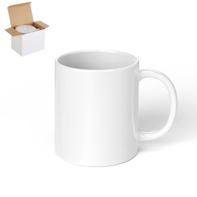
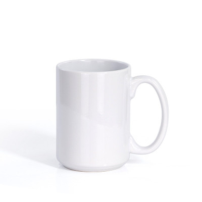
The mug specification: shape name or reference, capacity, body color, glaze type, interior finish, and whether the mug should stack. The artwork specification: the print method, the printable area in millimeters, the logo placement and size, the brand color references for every color used, and the clear-space rules. The durability and safety requirements: dishwasher safe, microwave safe, food-contact certification for the target market, and any abrasion standard. The production and quality terms: order quantity, sample approval process, color tolerance, defect rate allowance, packaging specification, and the delivery terms.
Attach the approved logo files in vector format, include the color references, and mark any areas of the mug that must stay blank. Send this spec sheet to the factory with the request for a digital proof and a physical sample, and do not authorize mass production until the physical sample is approved. The sample is not a formality; it is the moment where every assumption in the spec sheet meets reality.
Conclusion: A Mug That Earns Its Place on the Desk
A branded ceramic mug works when the design respects the object. Define the purpose first, place the logo where the mug's shape supports it, verify colors against a physical sample, choose the print technique that can actually reproduce the artwork, plan seasonal lines with discipline, and package the product as part of the brand experience. A mug designed this way does not end up in a drawer; it ends up in daily use, where it keeps working for your brand every morning for years.
Ready to put your logo on a mug that people keep? Storiware customizes ceramic mugs for brands worldwide, with logo placement guidance, physical color sampling, silk-screen, decal, and sublimation printing, and packaging that protects both the product and your brand. Start with the featured mugs below, and our team will handle the rest of the process with you.
Featured Ceramic Mugs from Storiware
Explore products featured in this guide:
Need a custom quote? Send an inquiry or browse our full product catalog.